RBGE Botanical Illustration Certificate: Unit 4 Reflection
This unit provided a crash course in colour theory. I explored colour matching to live subjects.
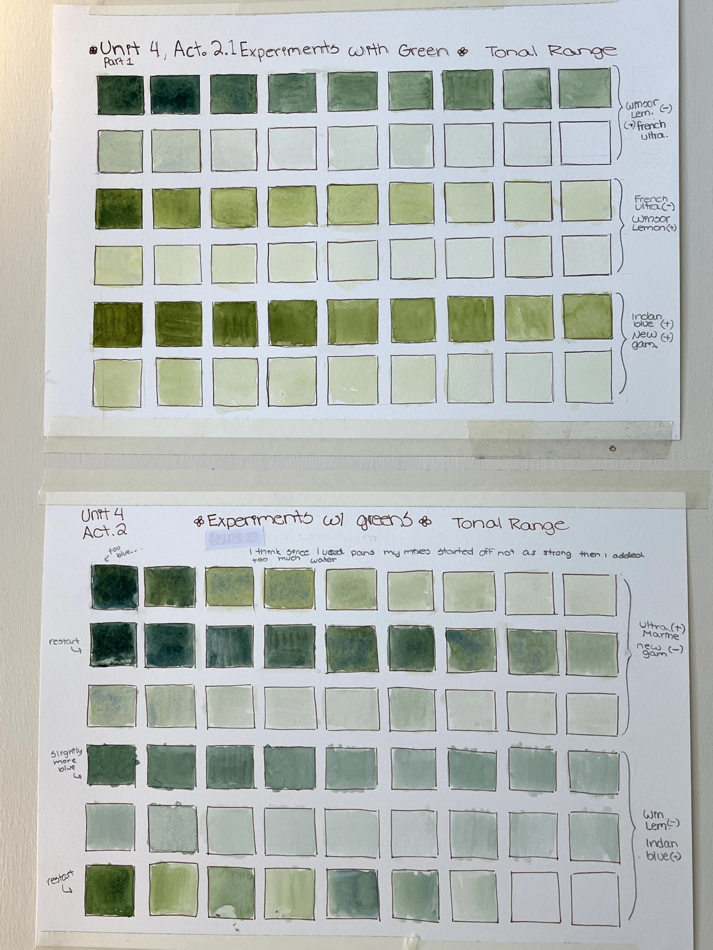
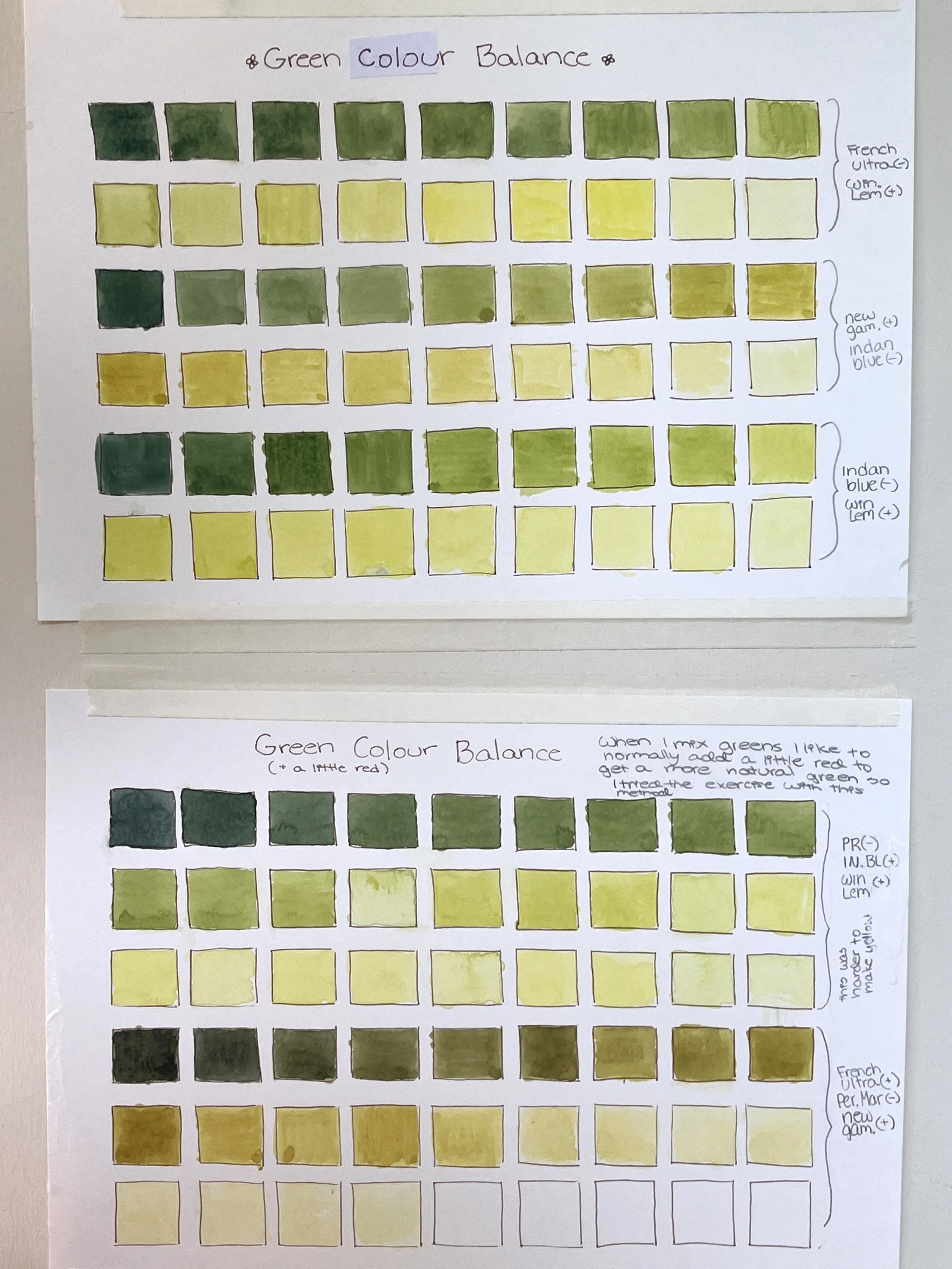
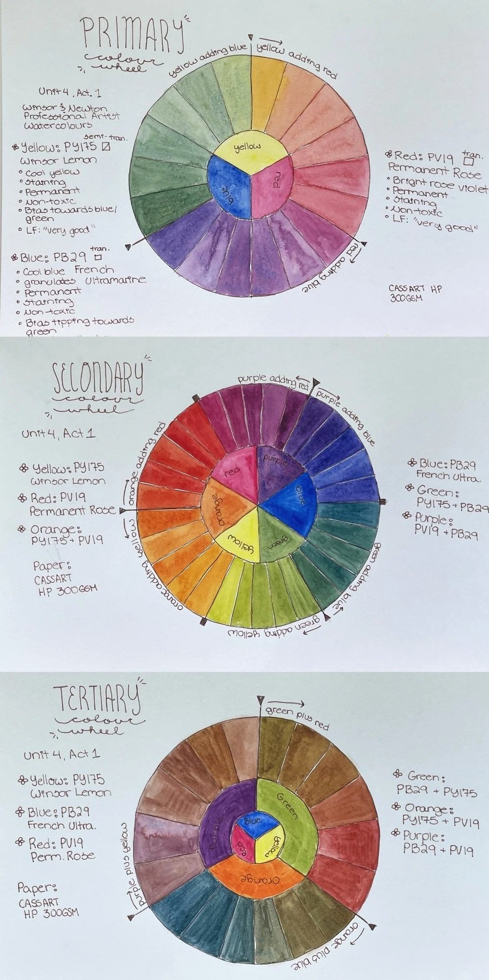
I started back at the basics and created colour wheels to deepen my understanding of colour mixes. I restarted the colour wheels several times as I got a bit lost and made a few wrong ones before getting the concept. I usually make colour charts using grids so this was a new way to interact with colour! I like the wheels and they make for excellent references.
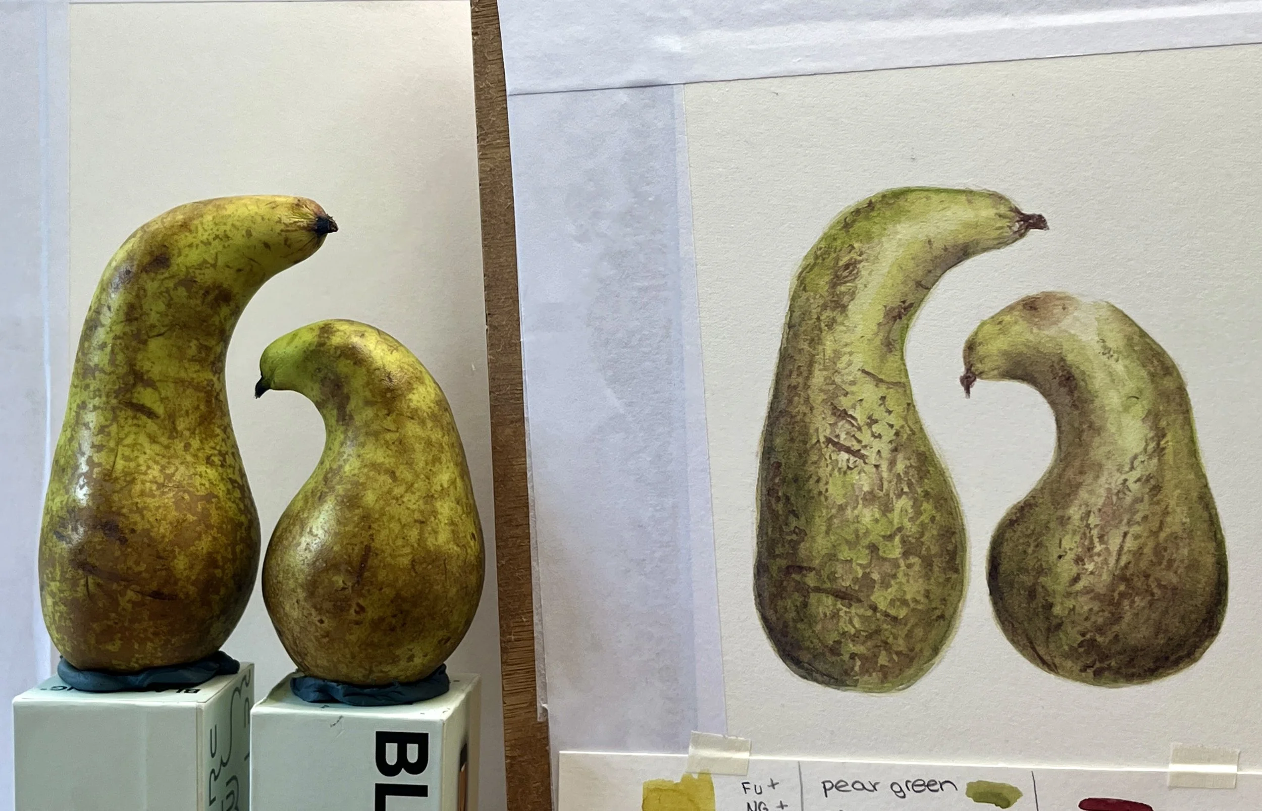
The most challenging portion of the unit came down to my pear composition. I decided on two pears with unusual curves that look like two friends about to embrace. I couldn’t paint just one, I had to paint both!
This made for a delightful composition, but also pushed me past my comfort zone to get the shapes right. In the end, I noticed my small one had a different inner curve than the real one despite measuring its points. It might also just be my eyes seeing double from staring too long at them. Overall, I like the composition and they have character which is what I wanted to convey!
The area I found the most difficult was definitely colour matching, it was a tough go with the leaf and pears, I ended up overworking some of the pears parts, you can see the small one on the right side looks a bit dull. This made me cautious with the leaf picture, and if I am honest it still looks a bit too lime greenish in the wrong way. I don’t think I got the leaf right, but I am allowing myself some time to get used to practicing.
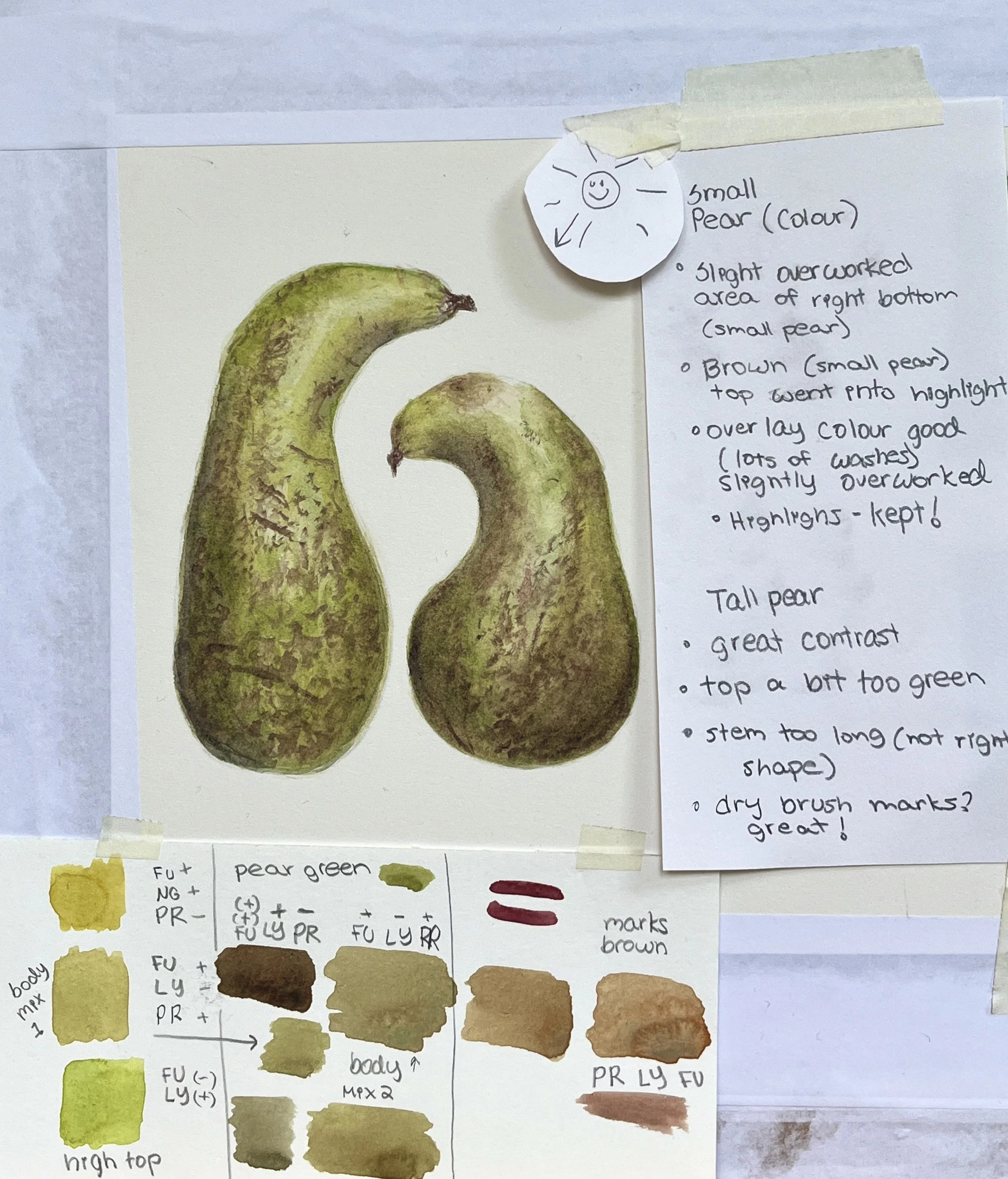
I noticed a big area I need to work on is not overworking the paper, this goes hand in hand with colour matching. If I make a good decision with my colours early on, there is less need for corrective washes at the finish line. I noticed this with my pears as I kept adding washes and didn’t know when to let it be. The paper can only take so many layers of paint (lets say about three washes, not including drybrush details) this means I have to be so careful with initial washes and getting them dark enough to depict the shadows and light enough for contrast needed without losing the highlights. This is a delicate balance like a waltz in botanical painting. If I go too far with washes the subject can lose highlights and that special ‘glow’ about it. It means the subject becomes dull and doesn’t have the effect of popping off the page. My resolve is to keep practicing to get more comfortable with my limited colour palette and colour mixing decisions.